Simply Snackin Branding and Packaging
As part of a rebrand, Simply Snackin' manufactures and sells premium all natural jerky. Commissioned to develop a new clarity and simplicity for the brand for this product offering dried chicken, dried grass-fed beef and Australian venison on the go.
The 4 Traits of an Exceptional Brand
Exceptional brands aren’t born, they’re made. Let me explain.
“THE BEST WAY TO BE MISSED WHEN YOU’RE GONE IS TO STAND FOR SOMETHING WHEN YOU’RE HERE.”
“QUIT OR BE EXCEPTIONAL. AVERAGE IS FOR LOSERS.”
“SURE, IDEAS THAT SPREAD WIN.
BUT IDEAS THAT DON’T GET SPOKEN ALWAYS FAIL.”
The above quotes by Seth Godin are a few of my favorites.
Seth has a knack for summarizing important human insights into short pithy statements and the above three perfectly set up this fundamental and important article about branding.


The 4 Traits
1. KNOW YOUR SWEET SPOT
Your sweet spot is defined by something simple but vitally important. You need to know what your audience wants and demands (and is urgently seeking a solution to). The more you answer to that, the more you become relevant. And the more relevant, the more valuable. The more commonplace and average your offering, the less valuable.
Your sweet spot is their pain point, their place where they are truly seeking a solution to something. It’s your job to find out what that something is, and then become the answer to solve that.
2. SIMPLIFY COMPLEXITIES
Experts (and doctors and lawyers often fall into this trap) think the more complex they make something, the better. Real experts know differently: real experts know that it’s in simplicity where true power to affect change exists and success awaits. Anyone trying to sell you how complex it all is is full of it.
3. STAND FOR SOMETHING REAL
Vague ambiguous offerings are suspect. A cousin to simplicity above is authenticity, reality for something you really care about. Don’t follow trends just because they’re trends. Find out WHY those trends are coming into play and find the undelivered need that is driving all of that adoption. Then you can lead with something that is real and true.
4. USE DESIGN TO CRYSTALLIZE, DIFFERENTIATE AND ENGAGE
Like the aroma of delicious bread or a well made meal, it hints at what’s about to come. It is the preamble to what will soon be in front of you. Design is to branding what aroma is to food. It gets us salivating for what we have yet to experience. Use design to bridge that expectation factor—not merely to “inform” but instead “to engage.”
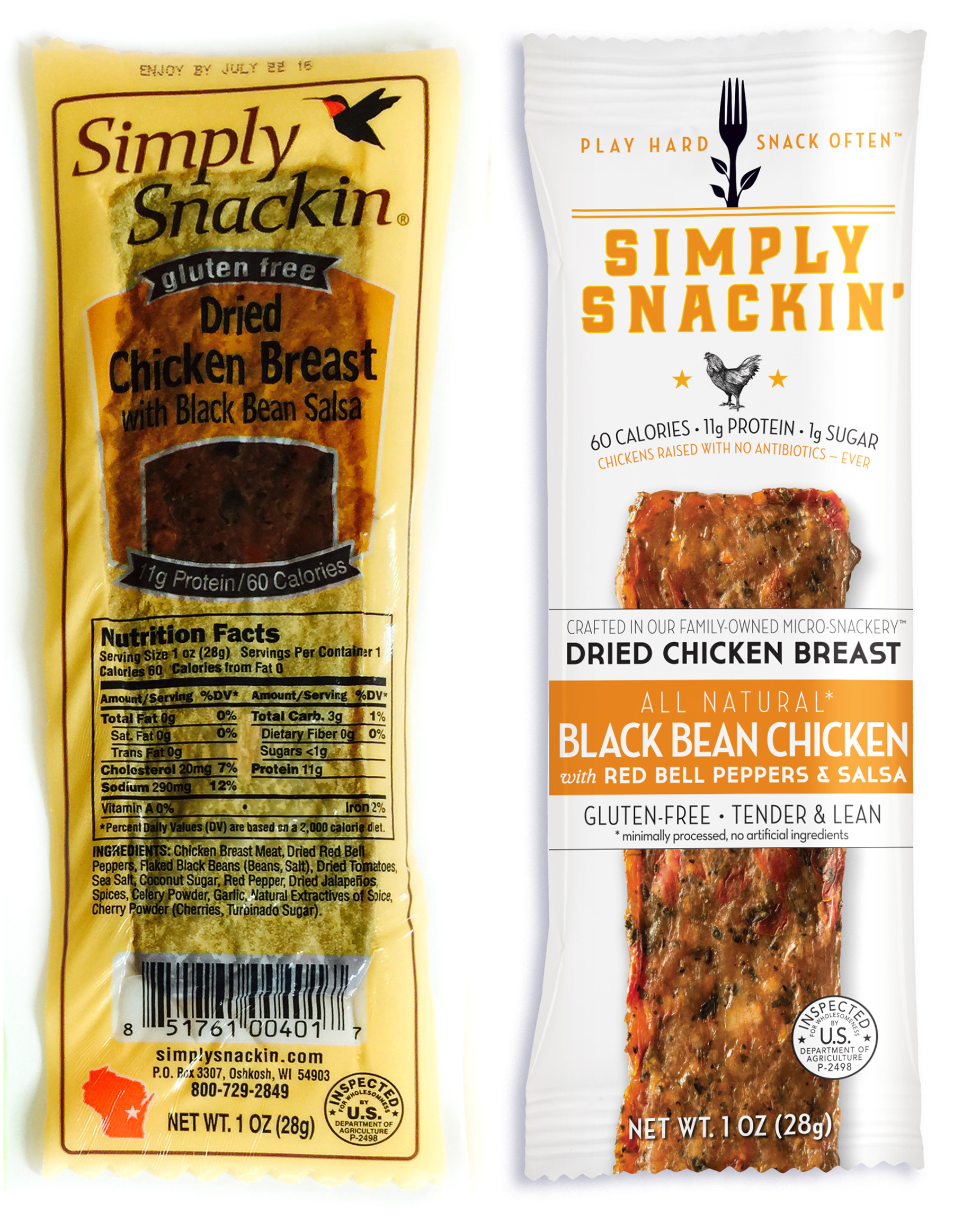
In the case of Simply Snackin’, they had a product that tasted great, that met or exceeded the needs of their consumer but from a branding standpoint, there were other parts that didn’t connect and needing fixing.
An exceptional brand 1) knows its sweet spot, 2) simplifies complexities, 3) stands for something real and 4) uses design to maximize differentiation and produce maximum engagement.
How were these 4 traits applied to the Simply Snackin' rebrand?
1. SWEET SPOT.
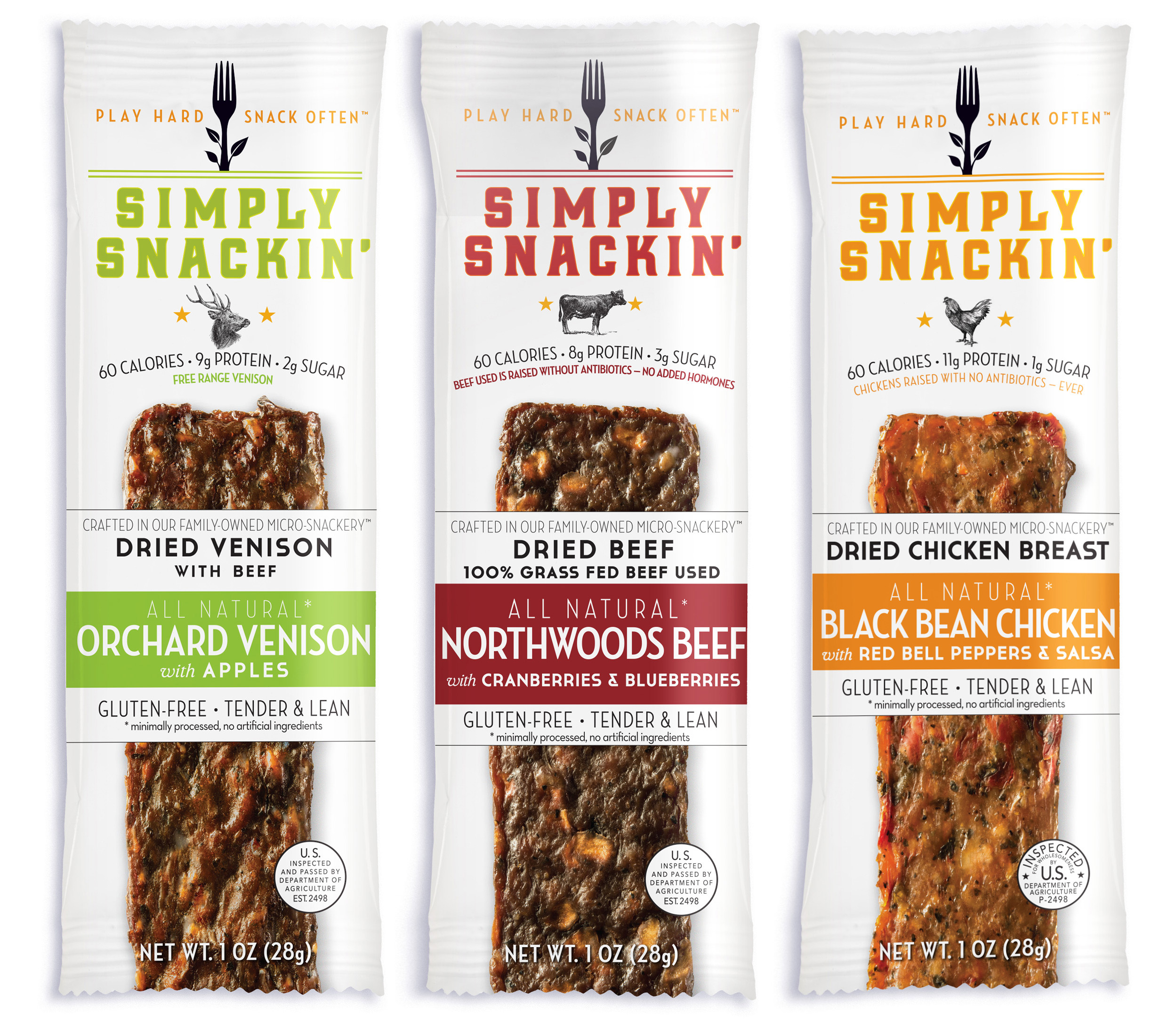
They only use grass fed beef, whole chicken breast and free-range Australian venison. All Non-GMO and gluten-free which are key triggers for this audience. We also knew that the consumer here enjoyed such bars when traveling, playing, hiking or being someplace where they wouldn’t have access or time for a regular meal. This translated to the declaration on the new package, “Play hard. Snack often.”
2. SIMPLIFY.
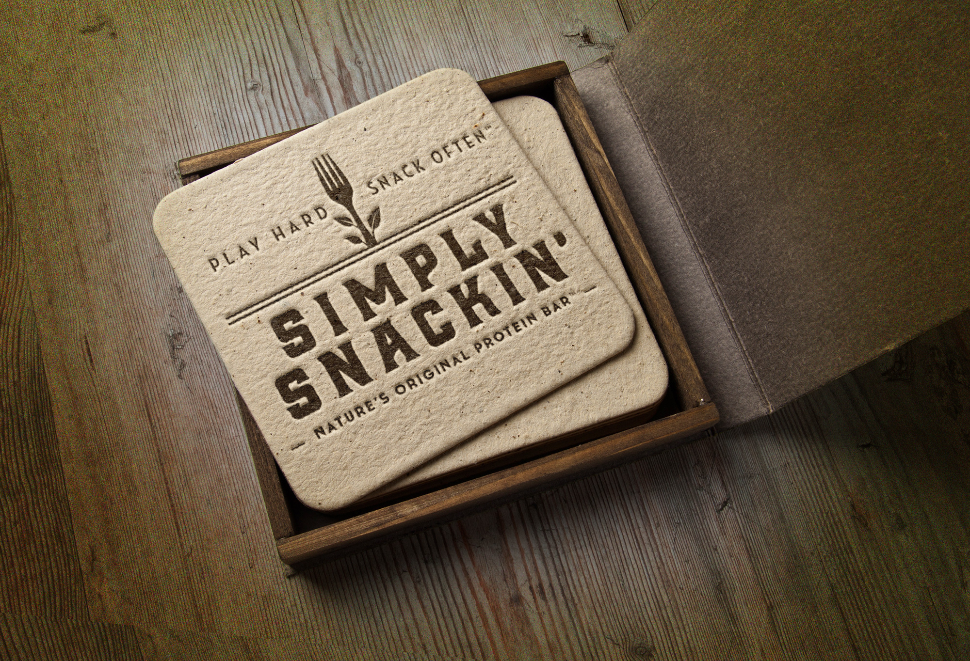
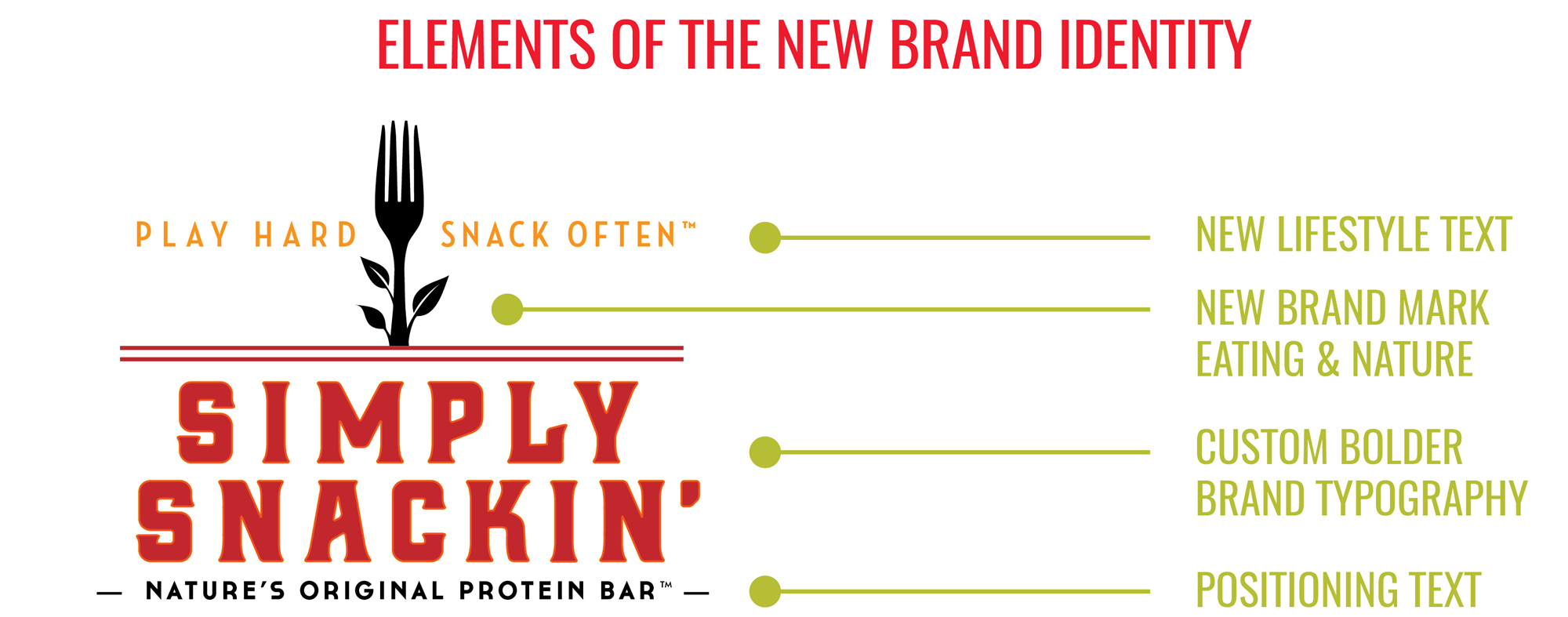
As you see above, the package design (as well as the brand identity with the leafy fork mark and typography) was majorly simplified with photography and a clean minimal design that was in direct contrast with other brands in this space that have gotten visually noisy. Furthermore, all chicken now was color coded as was all the beef and venison items, making it easy for the consumer to dial into what category of protein they wanted.
3. STAND FOR SOMETHING REAL.
We stripped away anything that was merely “informative” (i.e., ingredients and nutritional info) and put them on the back of the package. We eliminated the previous window in the package because it was too small to be effective and instead shot the product with very high definition photo techniques to add to the reality of this delicious product. This simplicity of product with the simplicity of the design brought to the table a product that reflected that it had nothing to hide.
Finally (and this part is very important), we looked at the history of this category and saw there was a history of “convenience snacks” and “meal replacements” which became today’s protein bars, a very popular and competitive category. We concluded we couldn’t win by being “one more premium jerky choice.” This conclusion resulted in developing the tagline “Nature’s Original Protein Bar” to truly stand for what the brand stands for while conveying a killer distinction.
4. USE DESIGN AS A TOOL.
Design here has been used to convey a simplicity that is the foundation and essence of the brand itself, from ingredients to the sourcing to the recipes. More to the point, the design was used to differentiate the product amongst the increasing glut of “premium jerky” space (differentiation being the primary reason one brands in the first place).
Before the Rebrand:

After the Rebrand: