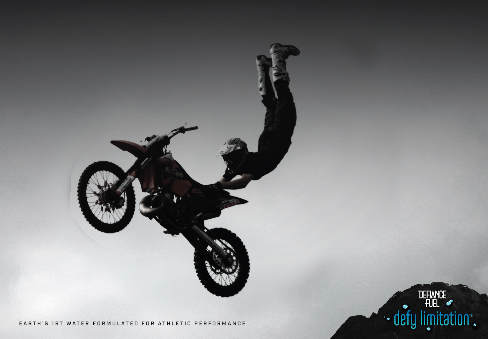
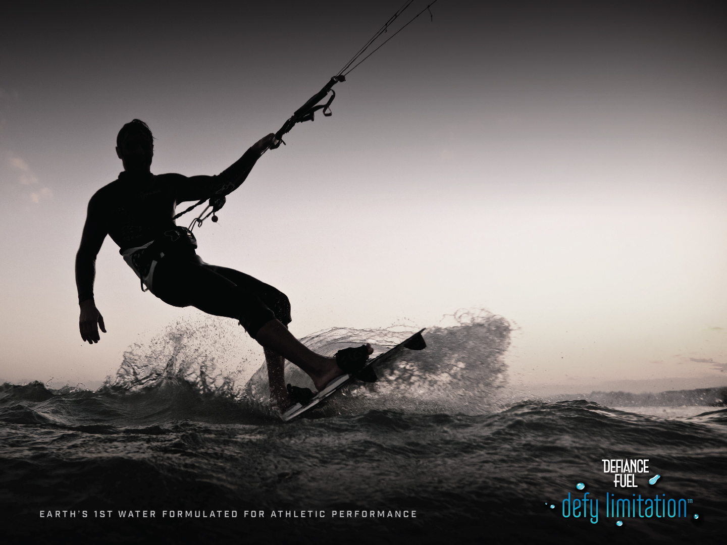
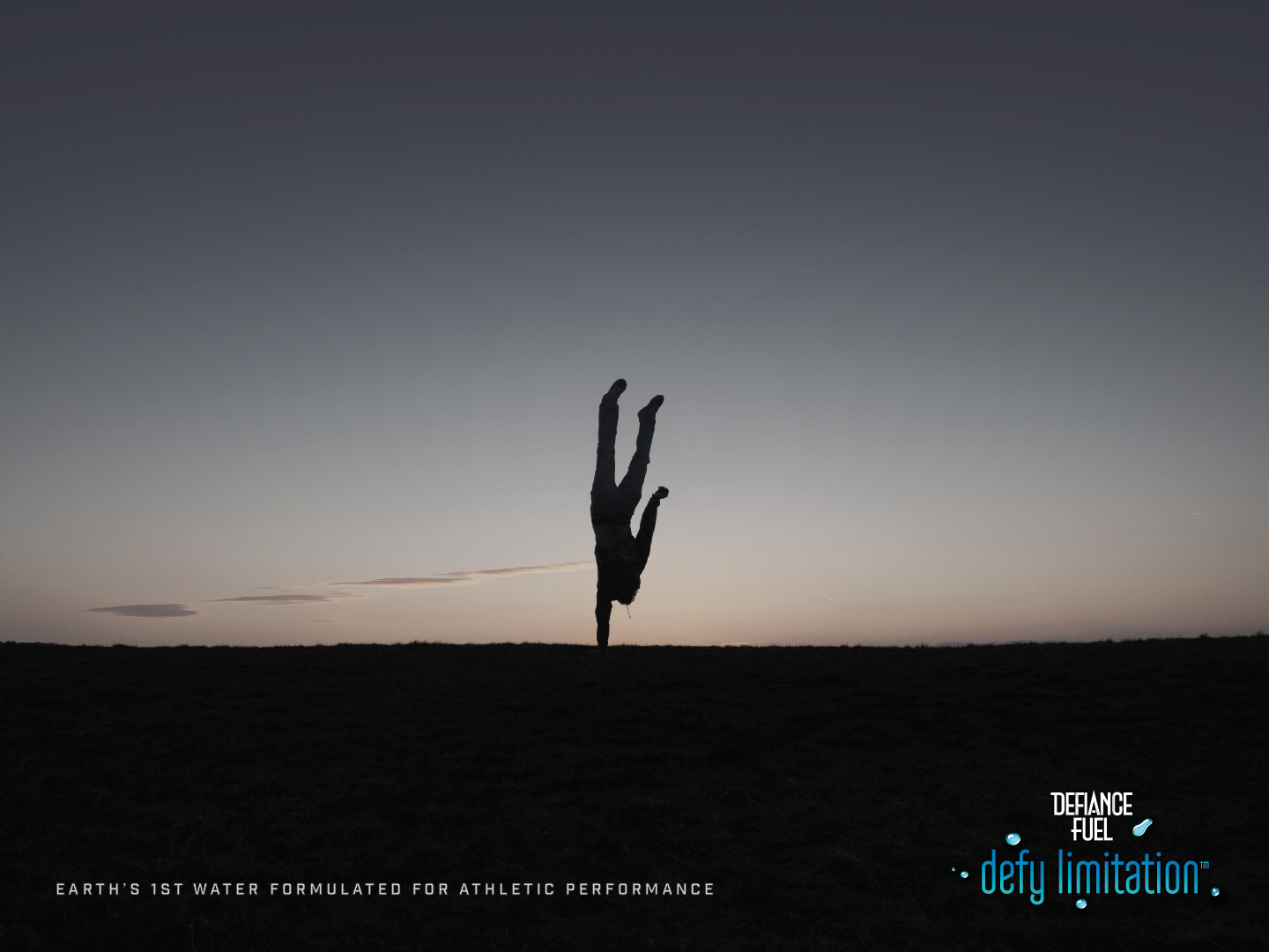
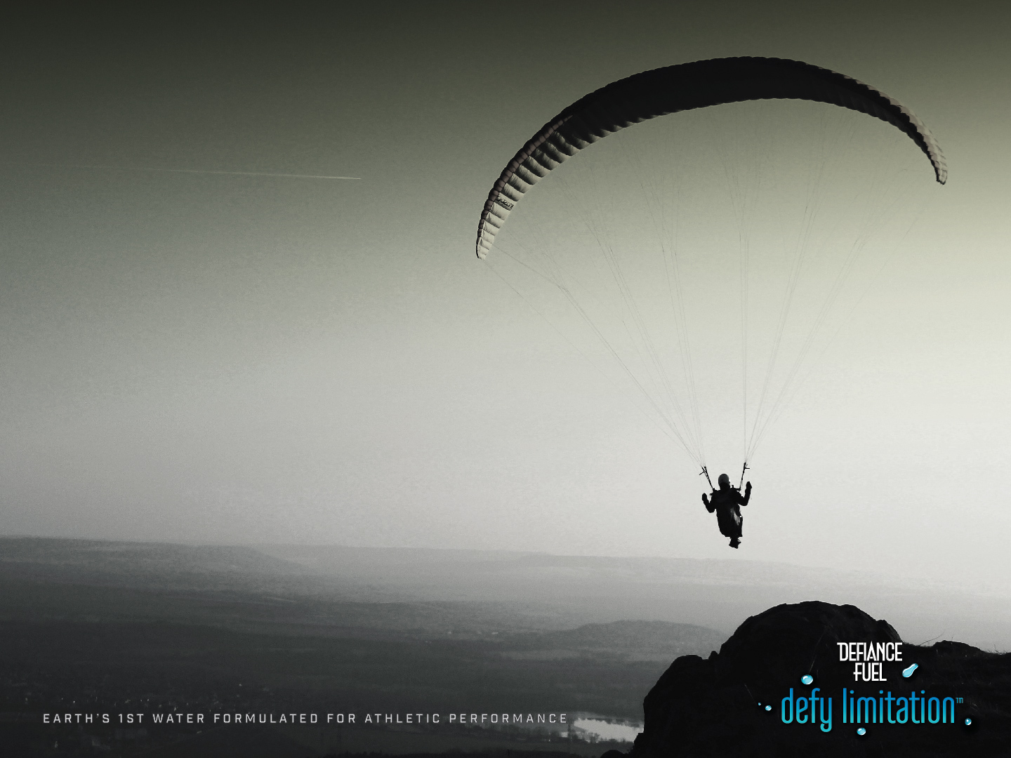
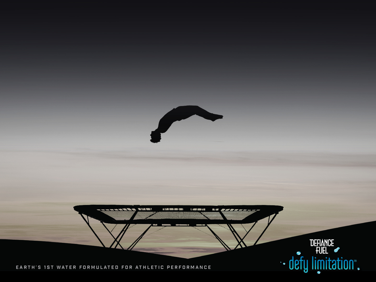
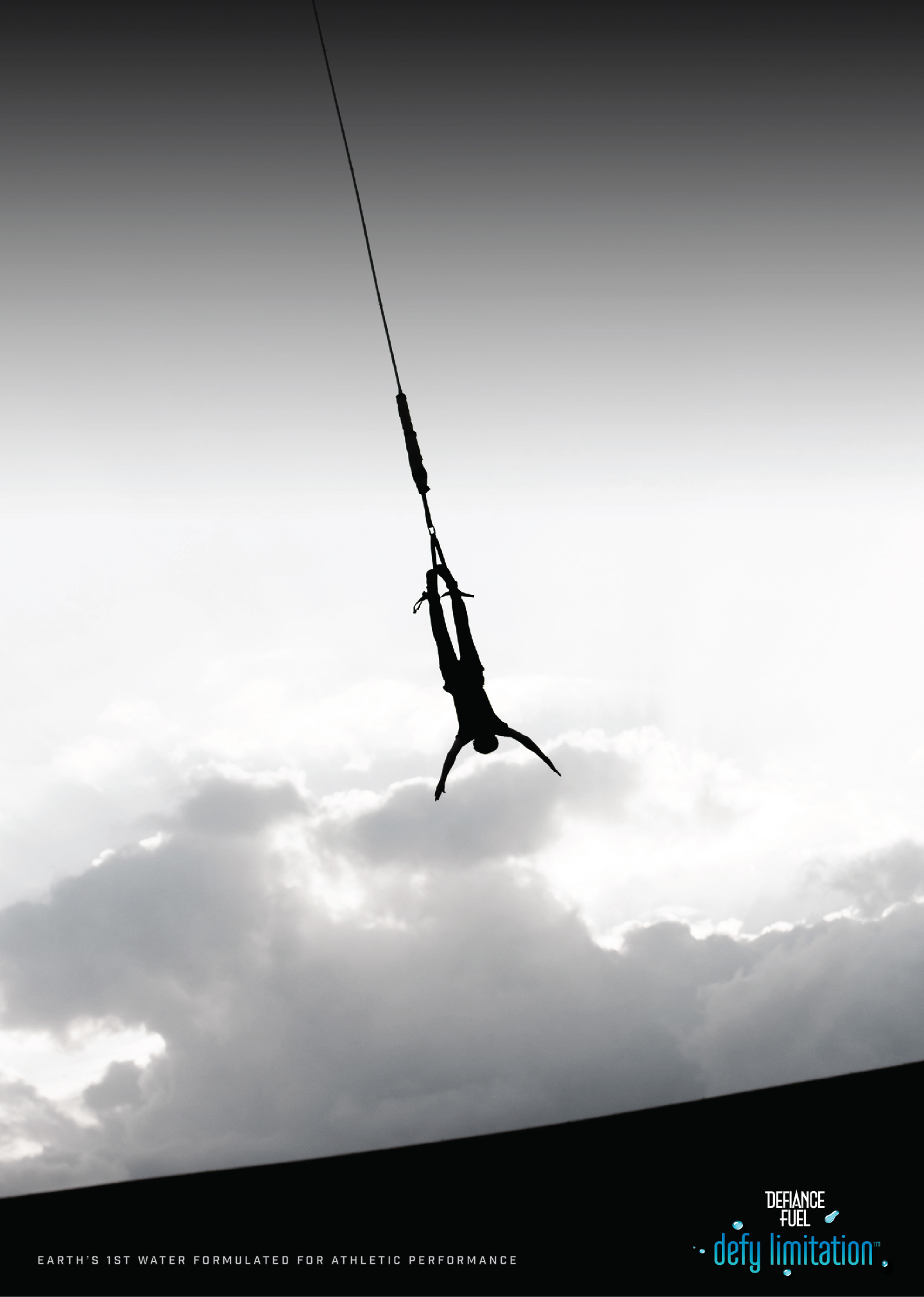
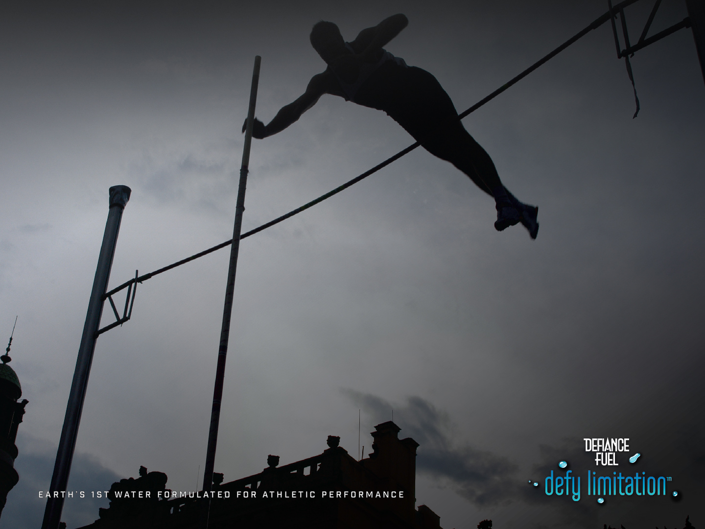
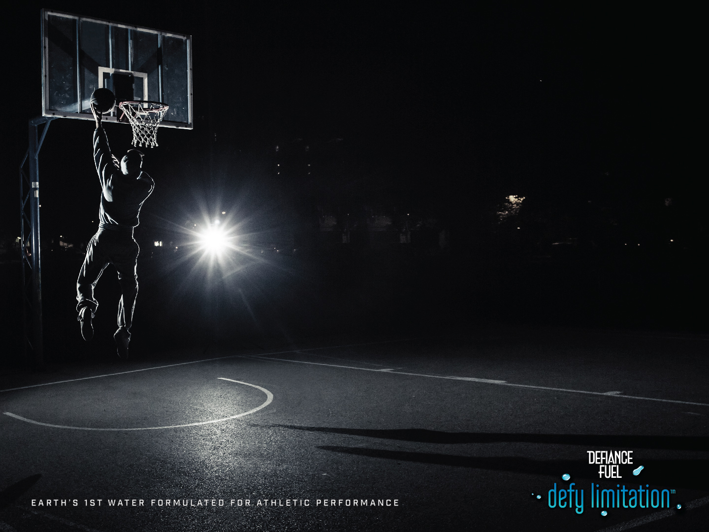
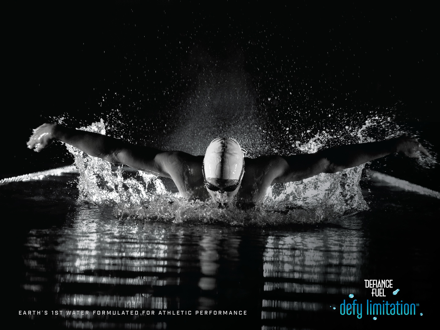
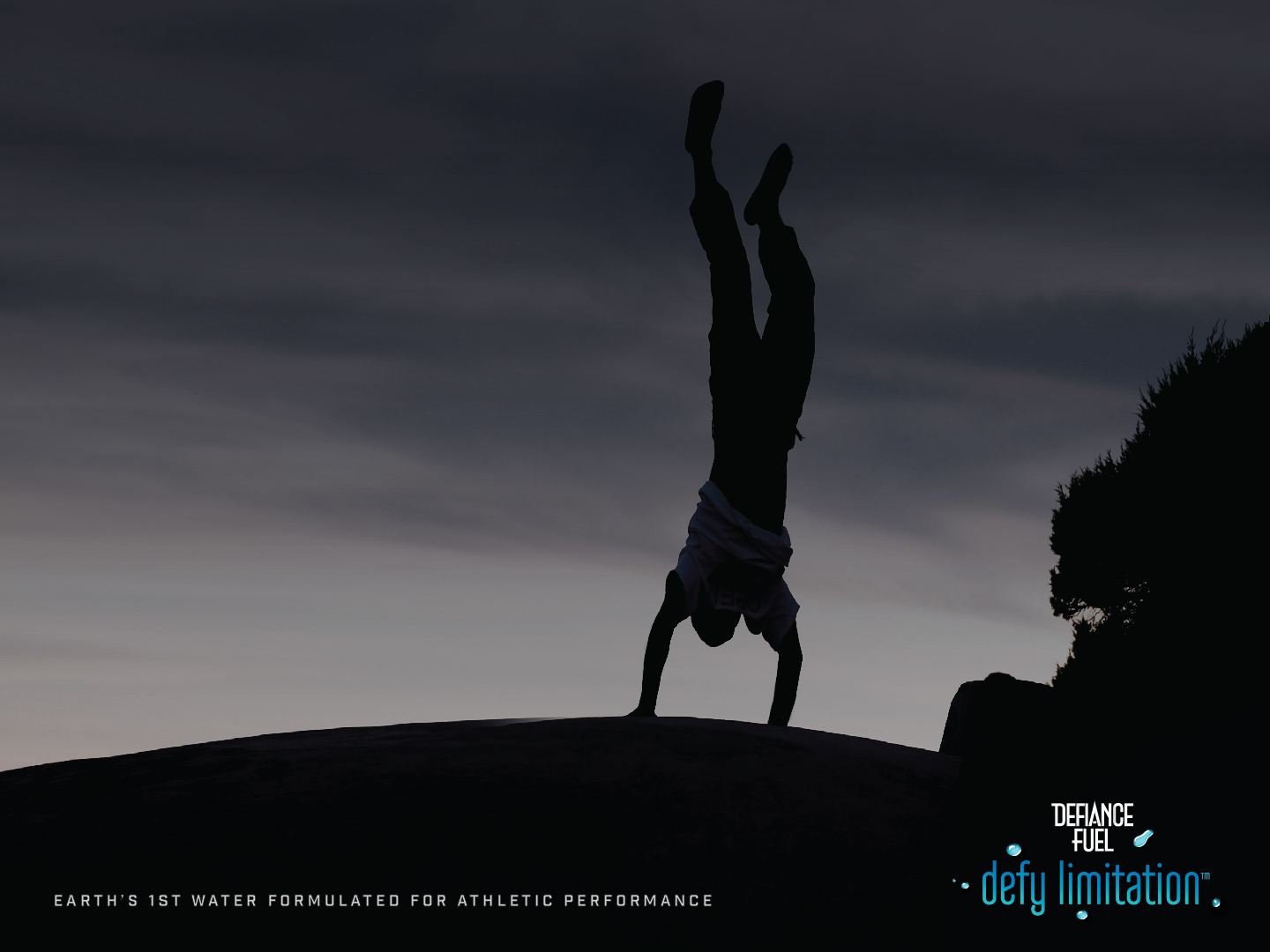
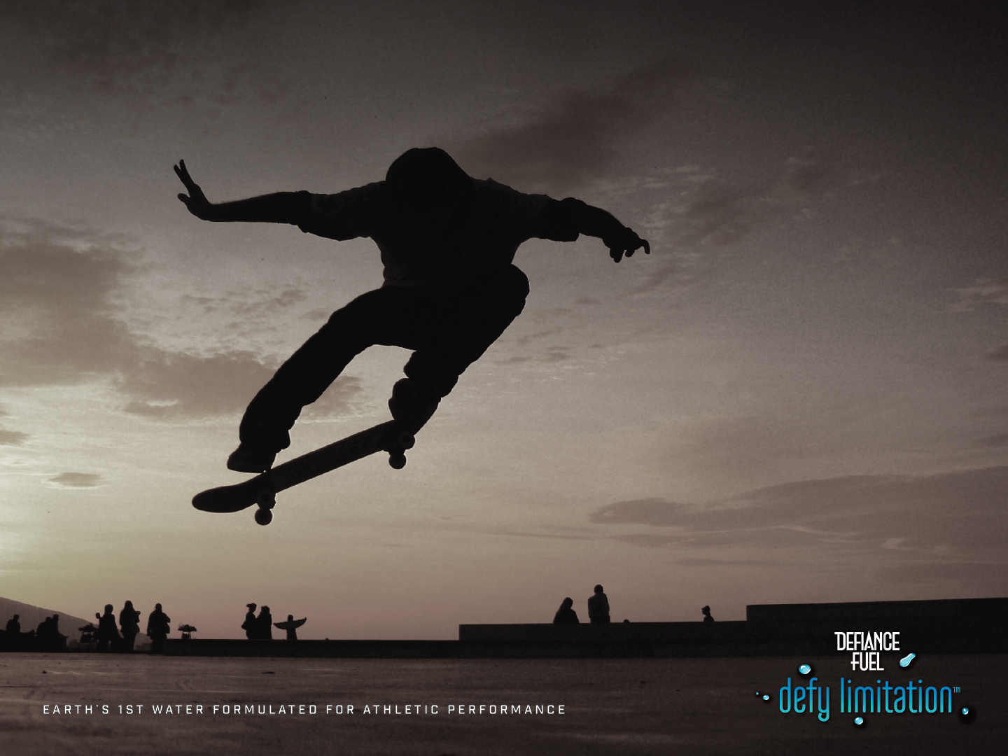
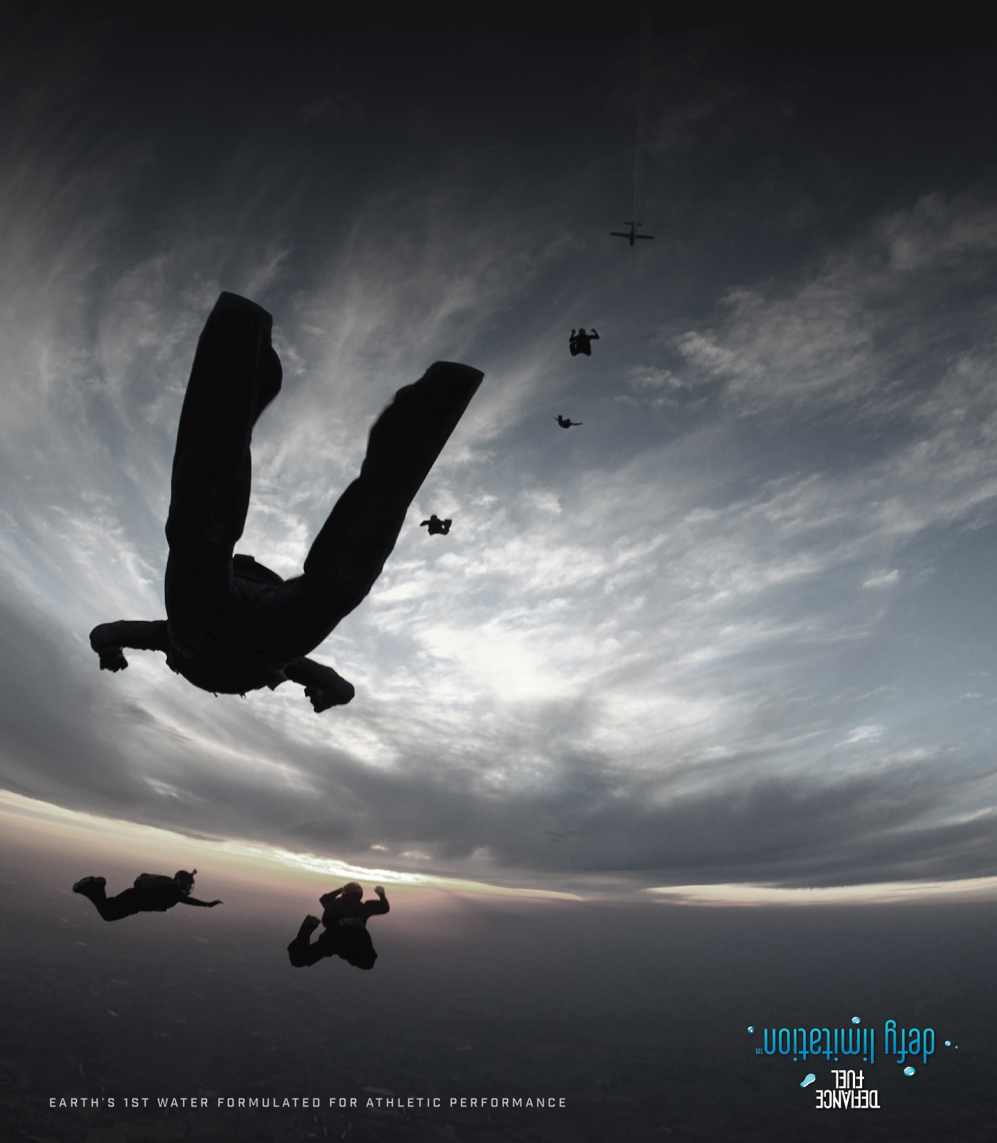
Defiance Fuel Branding and Packaging

I was asked to brand a water specifically formulated for athletes for natural, rapid recovery. In other words something that's found the actual source of why athletes take a long time to get their “second wind." After collecting some incredible insights into what drives athletes, I developed the name and even more importantly a tagline that mirrored the aspirations and values of the athletic mindset, a detail too often overlooked by startups and brand in general. So I told the client we needed to ask actual athletes these questions, “Why do you do what they do as an athlete? What’s your goal? Your agenda?” so we could isolate the exact driving impulse that summarized their drive. After asking various questions, crystalizing their passion and narrowing it down to something in their language, It came down to two words, “Defy limitation.”

Defiance Fuel is an unprecedented way to hydrate and rebound energy-wise, without the aids of sweeteners, caffeine or corn cyrup recipes.
 
It is a water that is formulated to aid rapid recovery and accelerated bounce back.
 
When I first met with the owner, there was no name, no brand, only a formula.
 
So I needed to develop the brand from scratch, starting with the name and slogan and then onto the package design, the look, the feel.
 
This was all captured in two key copy points.
 
First the slogan: "Defy limitation" which embodies the spirit of the athlete.
 
Next was the product descriptor,
            "Earth's 1st water formulated for athletic performance."
 
What follows is:
     • The brand identity
     • The package design
     • The poster series
 
Below is the package design using cobalt blue and silver as the primary colors for the brand's visual vocabulary.
Below is a series of posters that will flank the full product launch.
Below is probably my favorite poster (take note of the logo treatment in the lower right).
Back to Top